
Perth Theatre & Concert Hall
Perth Theatre & Concert Hall
- Brand development
- Brand strategy
- Design
- Media
The brief
Perth Theatre and Concert Hall play an essential role in supporting cultural life, wellbeing and the local economy across Perthshire and beyond.
Operated by the charity Horsecross Arts, the organisation had weathered years of disruption, changing audience behaviour and the lasting impact of the pandemic — all while continuing to serve diverse communities through two very different venues.
Horsecross Arts asked us to lead a full rebrand of the organisation and its properties. The name “Horsecross Arts”, while historically rooted, had become a barrier to awareness and understanding, often overshadowing the Theatre and Concert Hall themselves.
The brief was to create a clearer, more confident identity that could reconnect with audiences, re-energise the organisation and provide a strong foundation for future growth.
Icon
Perth Theatre and Concert Hall is a cultural landmark in the heart of Perth.
The Challenge
The Theatre and Concert Hall each have distinct personalities, programming and audiences, yet were being perceived through a single, confusing umbrella brand.
Post-pandemic, with audiences hesitant to return to live events, the organisation needed a bolder, more relevant proposition — one that honoured heritage, clarified purpose and restored confidence, without alienating loyal supporters.
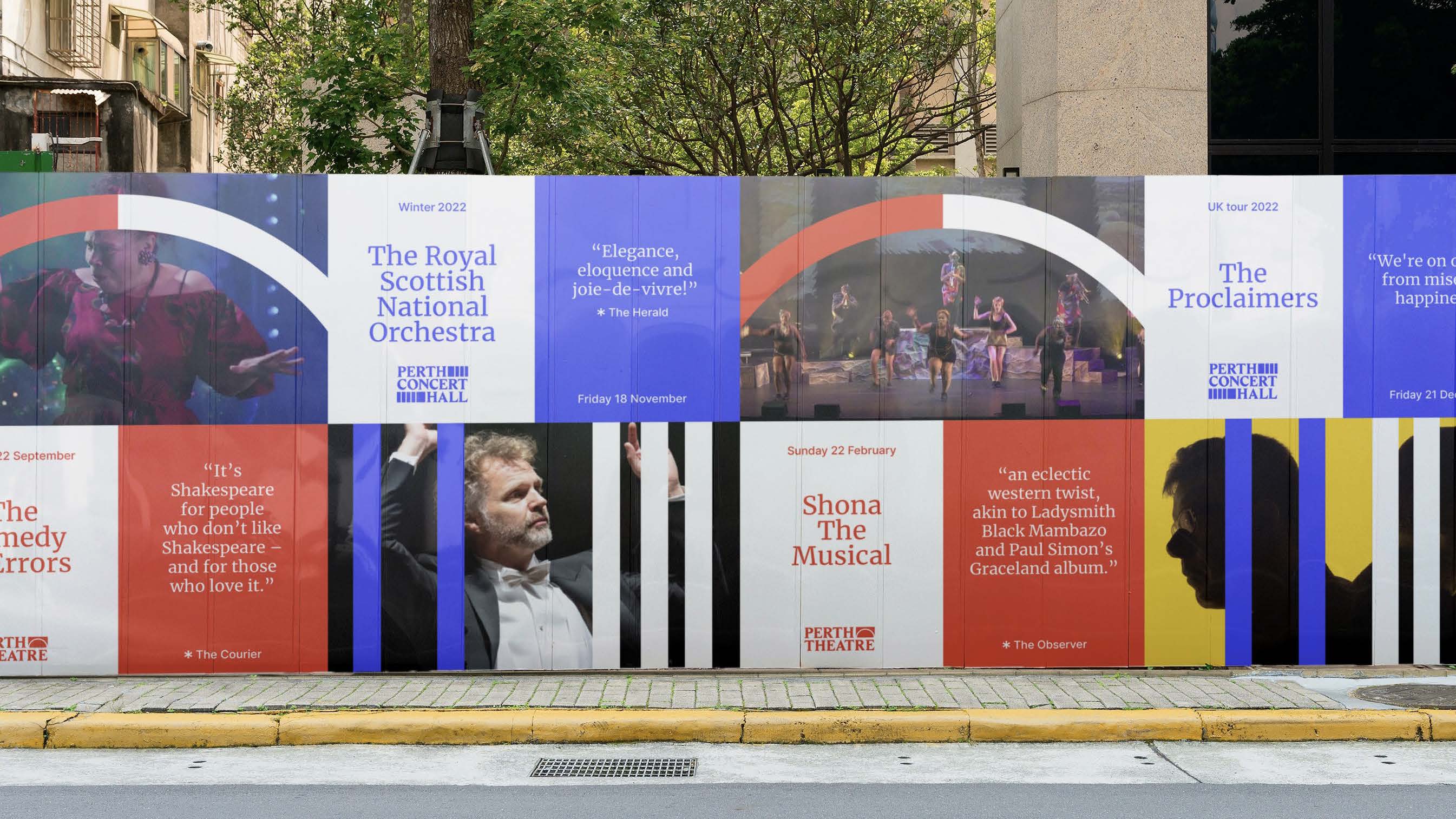
Outdoor
Outdoor advertising showing our vibrant new brand identity.
The Solution
We developed a new identity centred on Perth Theatre and Concert Hall, bringing clarity, pride and confidence back to the brand.
Grounded in extensive stakeholder and public engagement, the rebrand celebrates the architectural heritage of both buildings while looking firmly to the future.
A bold, flexible visual system allows each venue to express its own character, while uniting them under a shared purpose and tone of voice — helping audiences clearly understand who they are, what they offer, and why they matter.
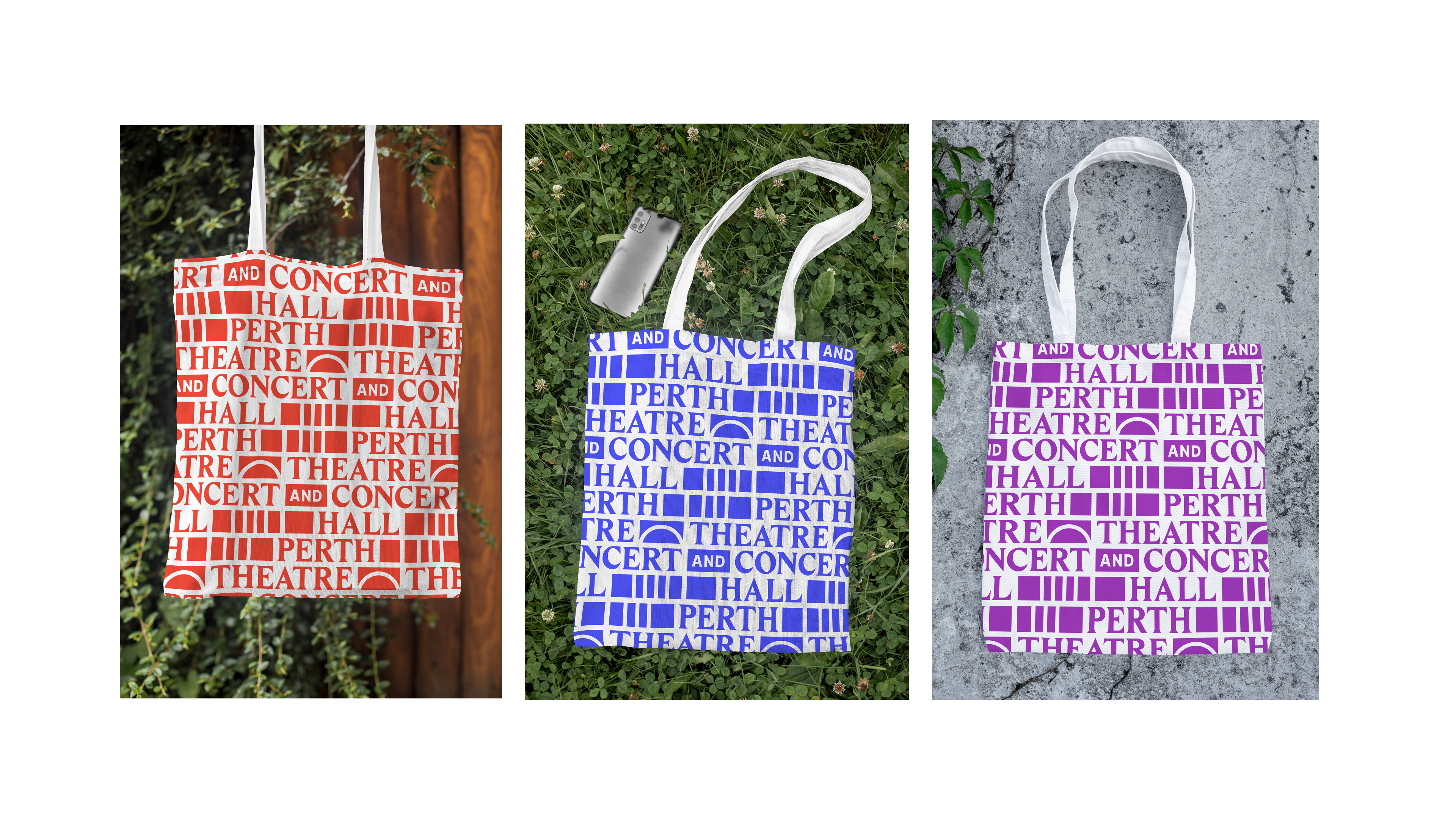
Logos
Perth Theatre
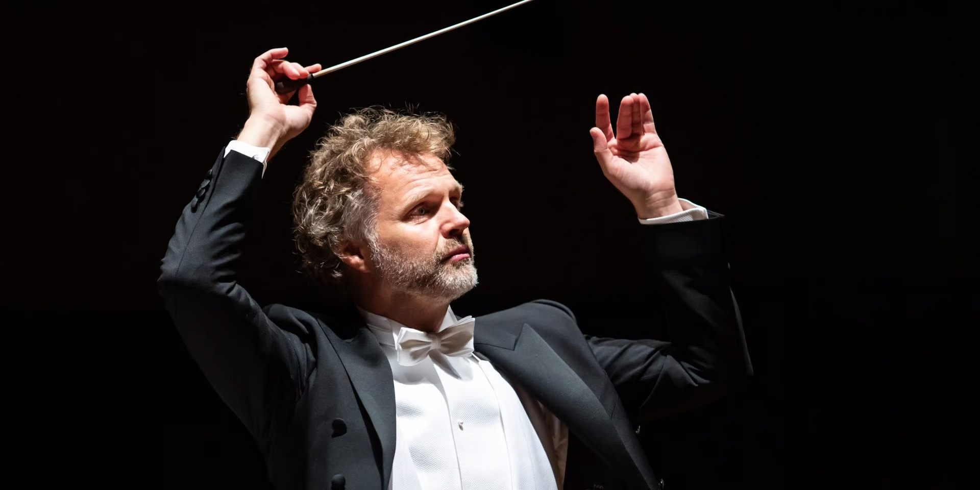
The colour is inspired by the seating in the Theatre, the chairs have a beautiful red fabric. The arch shape reflects the original frontage of the theatre. We chose the typeface to have the same feeling as the original but updated, modernised and customised for this project.
Perth Concert Hall
The colour is inspired by the blue seating in the Concert Hall. The vertical shapes represent the seats, windows and acoustic panels of the concert hall.
Perth Theatre & Concert Hall
The logo uses the details of the buildings as the main design elements. The arch-way of the High Street Theatre entrance, plus the vertical shapes of the seats and bricks of the original exterior wall, and the windows and acoustic panels of the Concert Hall. The Sans Serif letters are used to introduce our company-wide font.
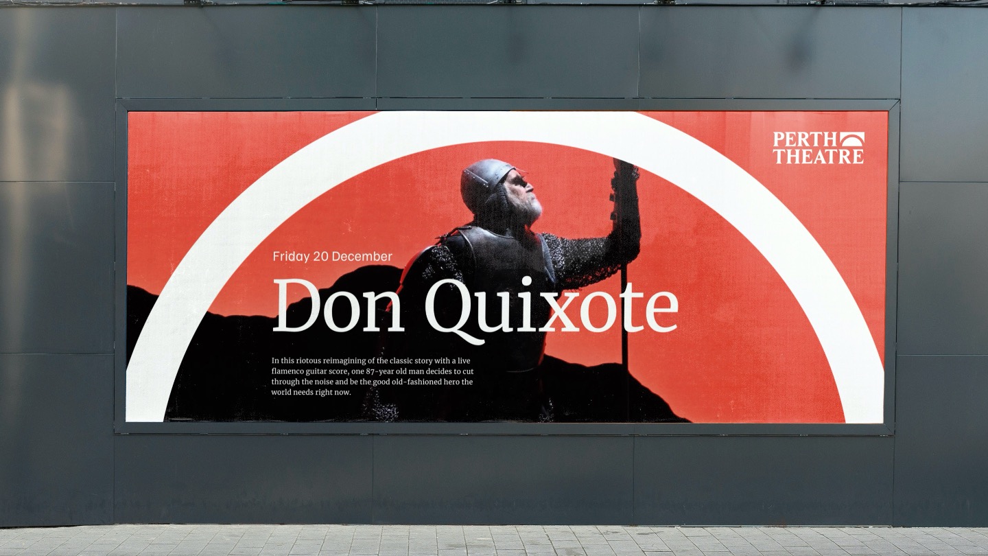
Bringing the brand to life through new events posters.
"The visual identity has taken inspiration from the fabrics and symbols of our venues, with flexibility for the digital age. But it is the human input and impact of the re-branding process that has re-energised the whole organisation and strengthened the bond we have with our communities."
Steven Stewart, Trustee and Director of Communications, Stagecoach Group plc