brightsignals.co.uk
Design System
Hello bright one!
This page lists all of the content blocks that are available for you to use when building up pages on our our website.
Any type of page really, including:
- Work pages
- News articles
- Basic content pages like the one you're looking at right now.
- Services pages
The following lists all available content blocks, their names, and tells you a little bit about their features and what they can do as some are quite flexible. This block I'm using right now is a Section text block, but we'll talk about that later as there's a section text block further down the page.
The one below is a full width media component ↓
Full Width Text
I am a full width text component, and this sentence you are reading right now (yup, me) uses the Preamble style, to create larger intro text for impactful statements.
I can also have my BG colour set to one of the brand colours. I default to white but have selected yellow for this example.
Available fields and features
- Title — Becomes an H2 if used
- Body Text — WYSIWYG editor
- BG colour (pick 1 of 8)
I'm actually pretty flexible and can be used quite creatively ... e.g., on some pages I'm using large type and an arrow like this one (↓), to guide users like the next block.
Large title ↓
I'm a Full Width Text block, but with a large title using "Offset Header H1", and I'm using a down arrow that you can cut and paste. I've also set my bg colour to black in this case.
Typographic Hierarchy (and arrows)
I'm also a full width text panel, but I'm here to show you our typographic hierarchy.
You can change my background colour to one of the brand colour, but I've selected white since we're talking about text and and a typographic hierarchy.
Heading 1
Heading 2
Heading 3
Heading 4
Preamble
Body text
We also use arrows as part of our refreshed brand which can be used as useful directional icons. Just copy and paste me into any text and then set my style.
Arrows:
↑
↓
←
→
Subtitle
Title
Section Text
Remember me? I'm a Section Text component, and I have the following fields that you can chose to use, or leave blank.
Available fields and features
- SubTitle
- Title
- Text — A WYSIWYG editor (that's what I typed this text into)
- Block colour — you can pick one of 8 background colours to use to help you create clearly defined areas.
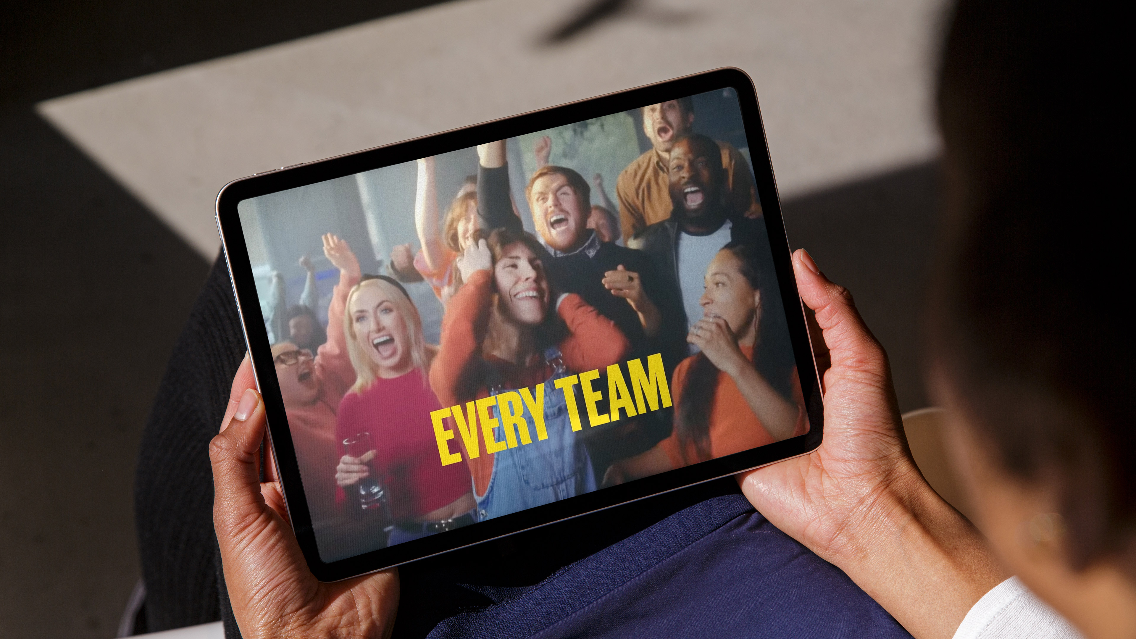
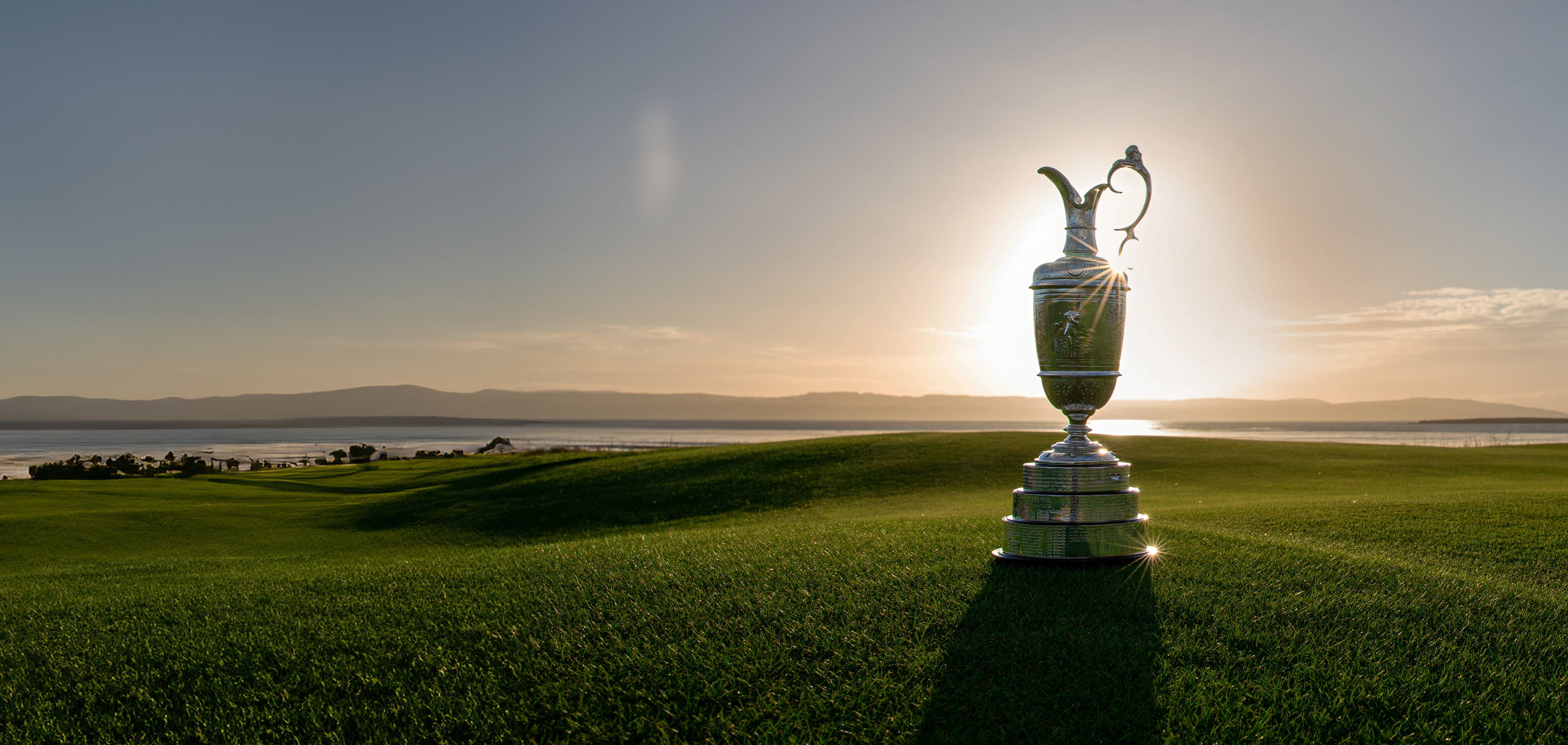
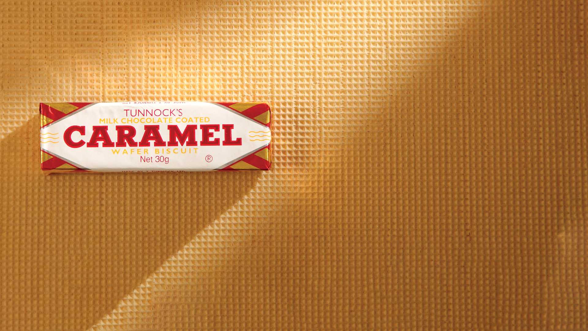
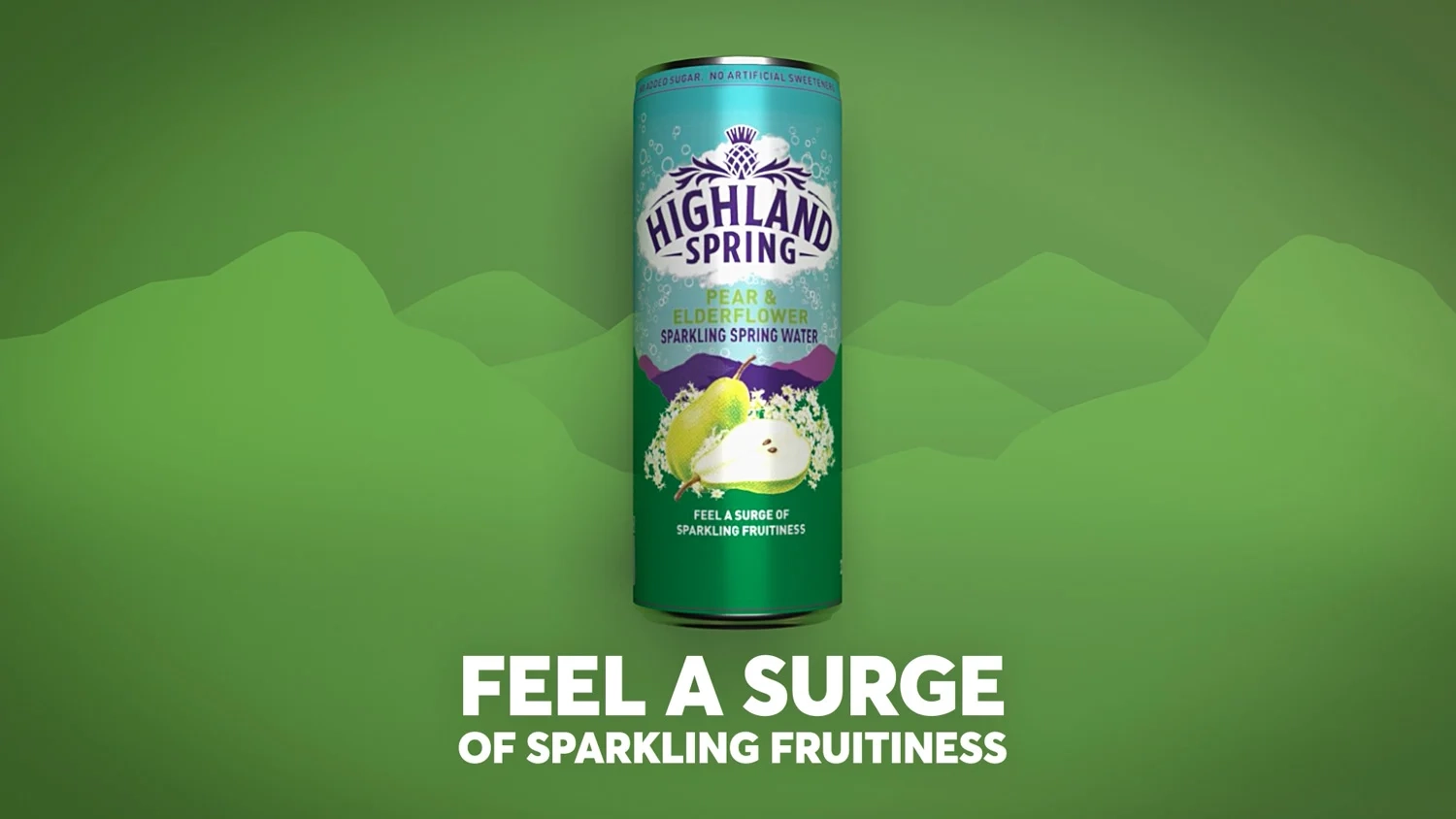
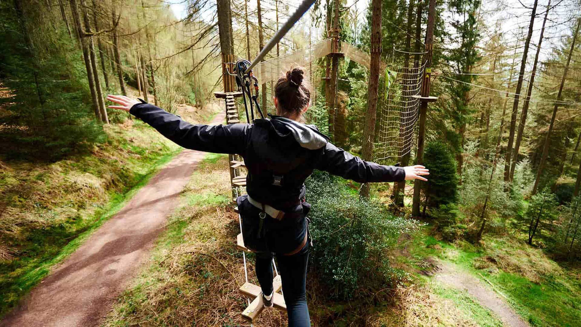
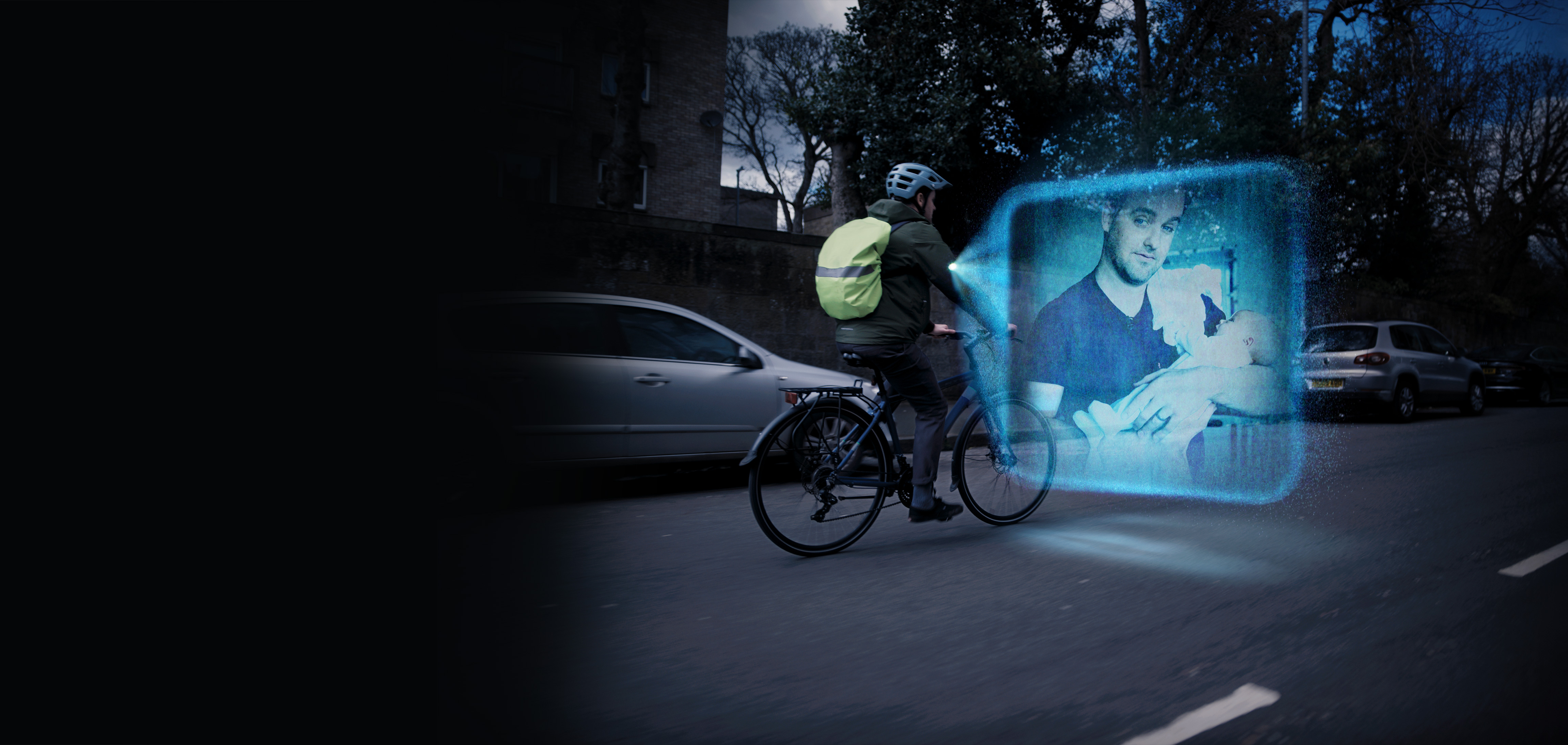
Sticky text with media
I'm a Sticky Text with media content block.
← I'm a clever content block that keeps text stuck while the media items scroll. This is really useful for showing lots of creative executions whle you read about them.
I have the following fields and features:
- Title – You can leave me blank, but if you use me I get wrapped in an H2 tag.
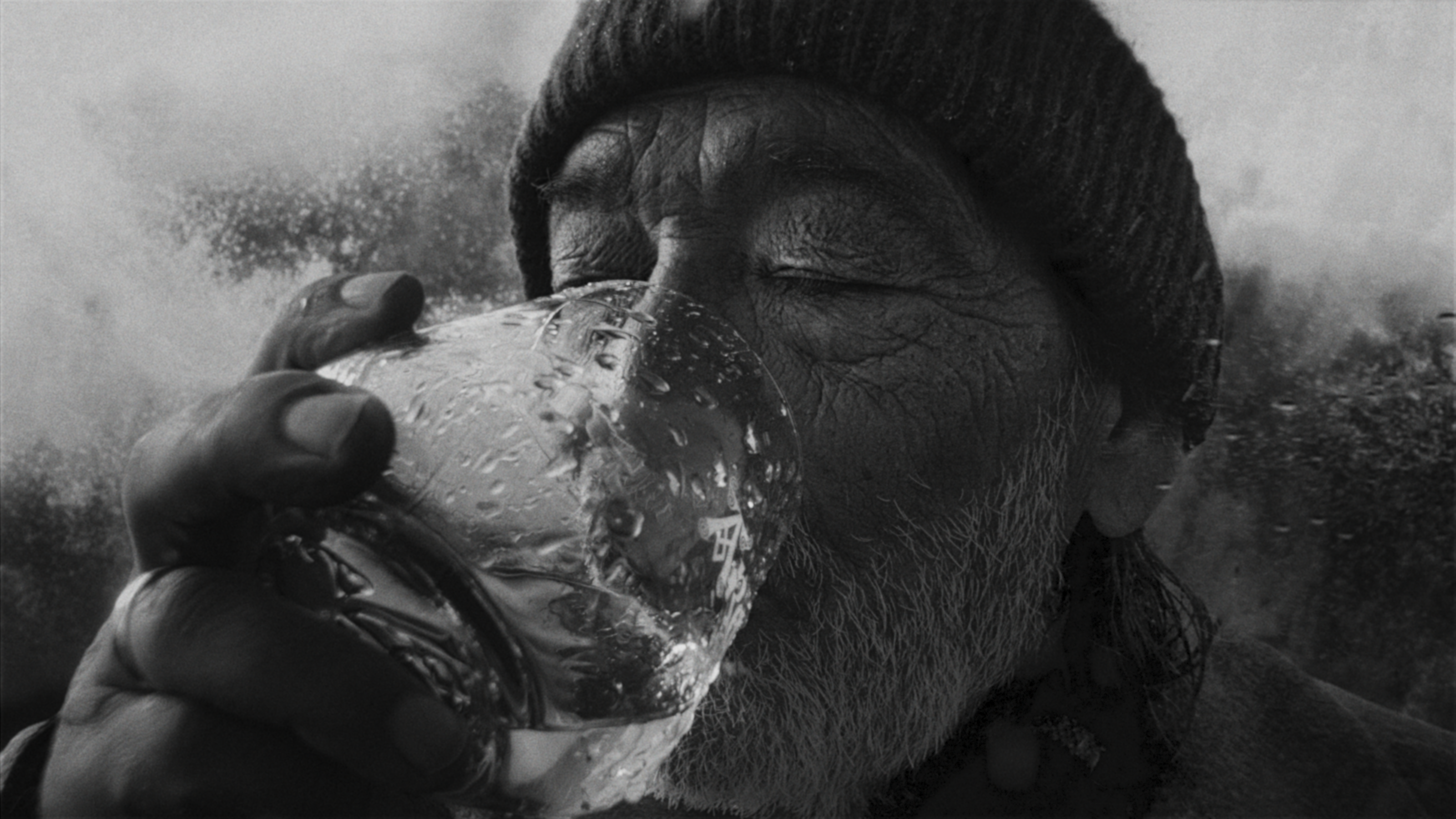
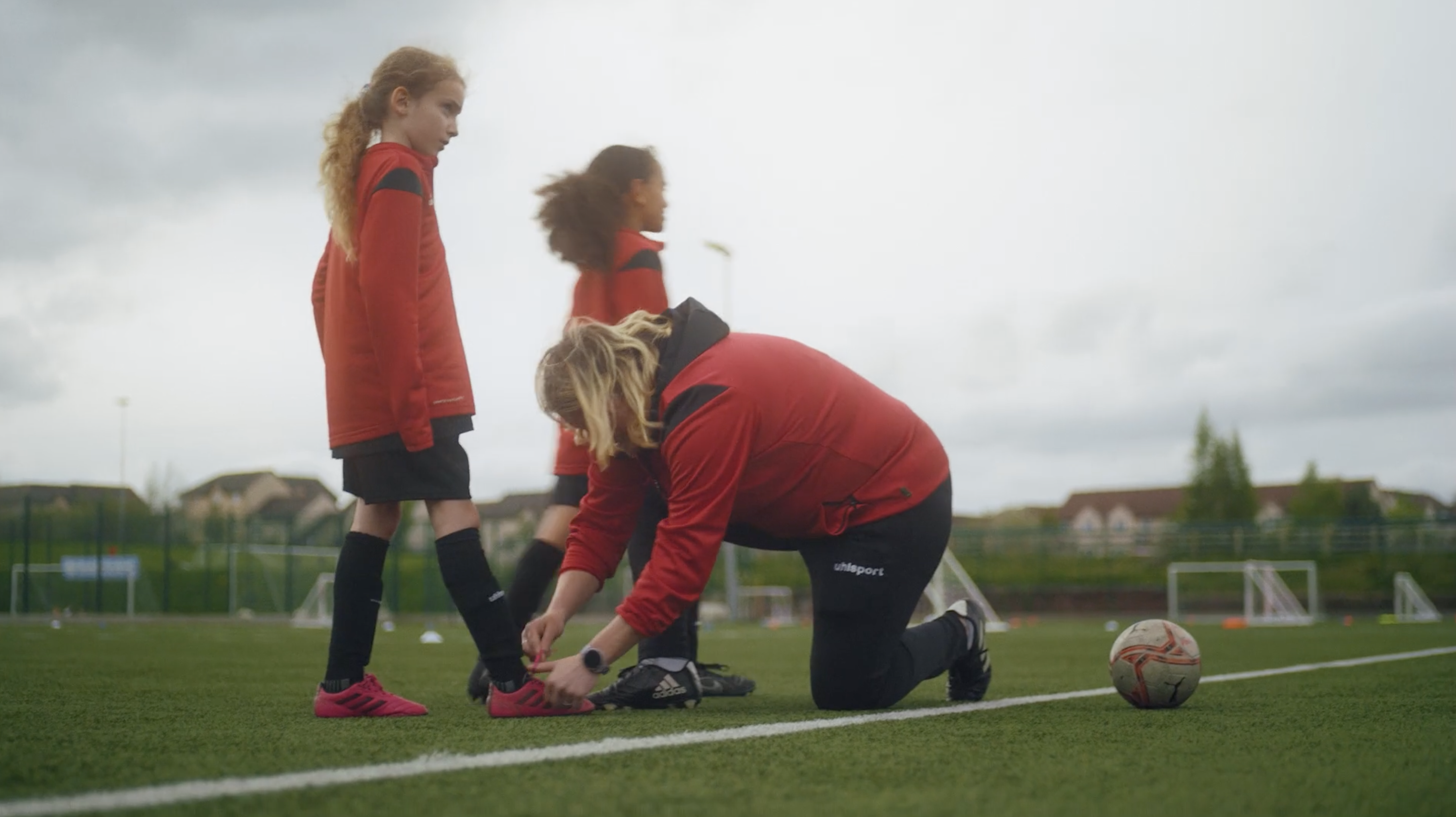
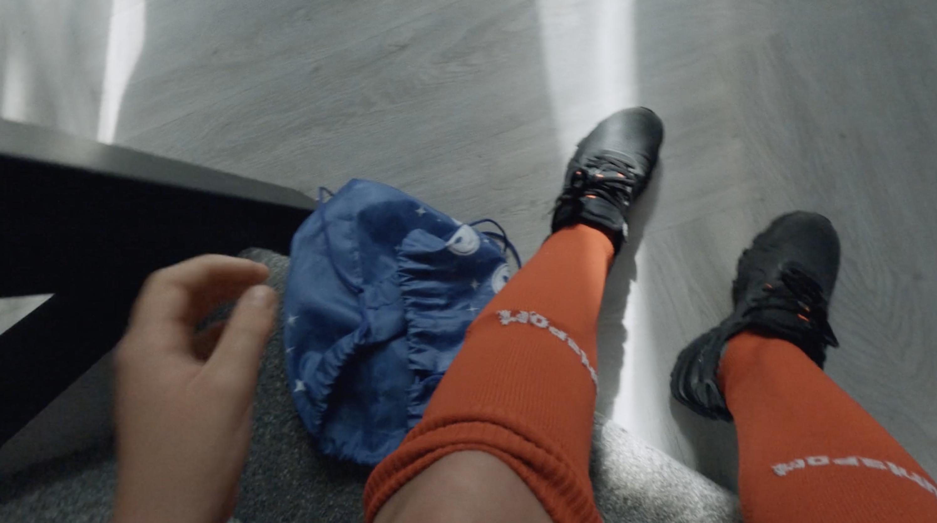
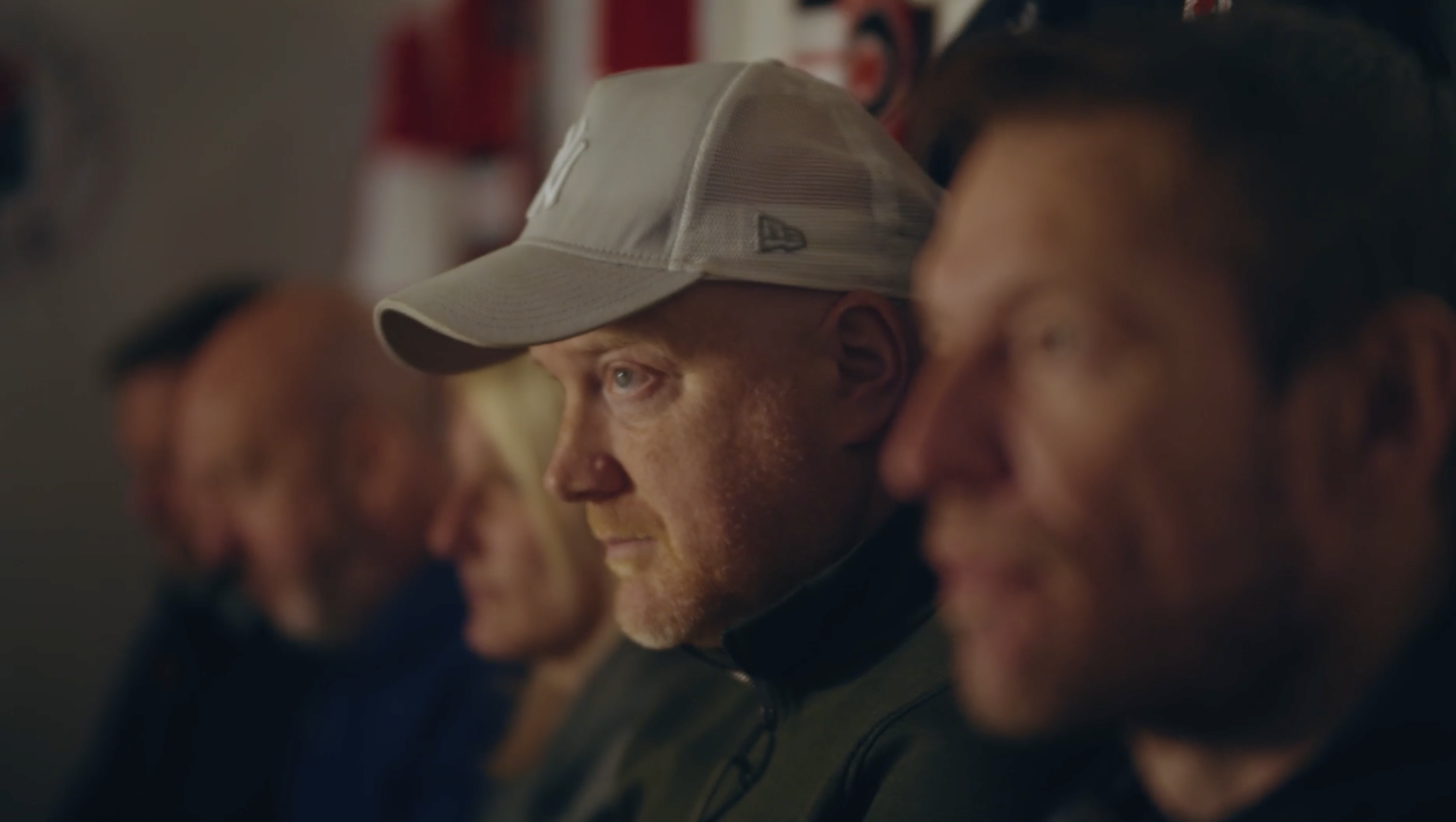
- Media — You can add multiple media items and sort them by dragging and dropping. You can add an image ... and if you add a still you can even add a Video URL (not embed) if you want to then launch videos.
I've added 4 media items showing two with video URLs and two that are just images.
Stats
I'm a stats panel and have the following fields:
Title — you can leave me blank, but if you use me I'm wrapped in an H2, Intro Text — A WYSIWYG editor. Items — you can add and reorganise (by dragging and dropping) stats that then appear quite large and impactful. You really only need to use the "stat amount" and "Supporting Text" fields though. BG colour — you can pick one of 8 background colours to use to help you create clearly defined areas.
100%
supporting text
20X
supporting text
20%
Increase in conversions

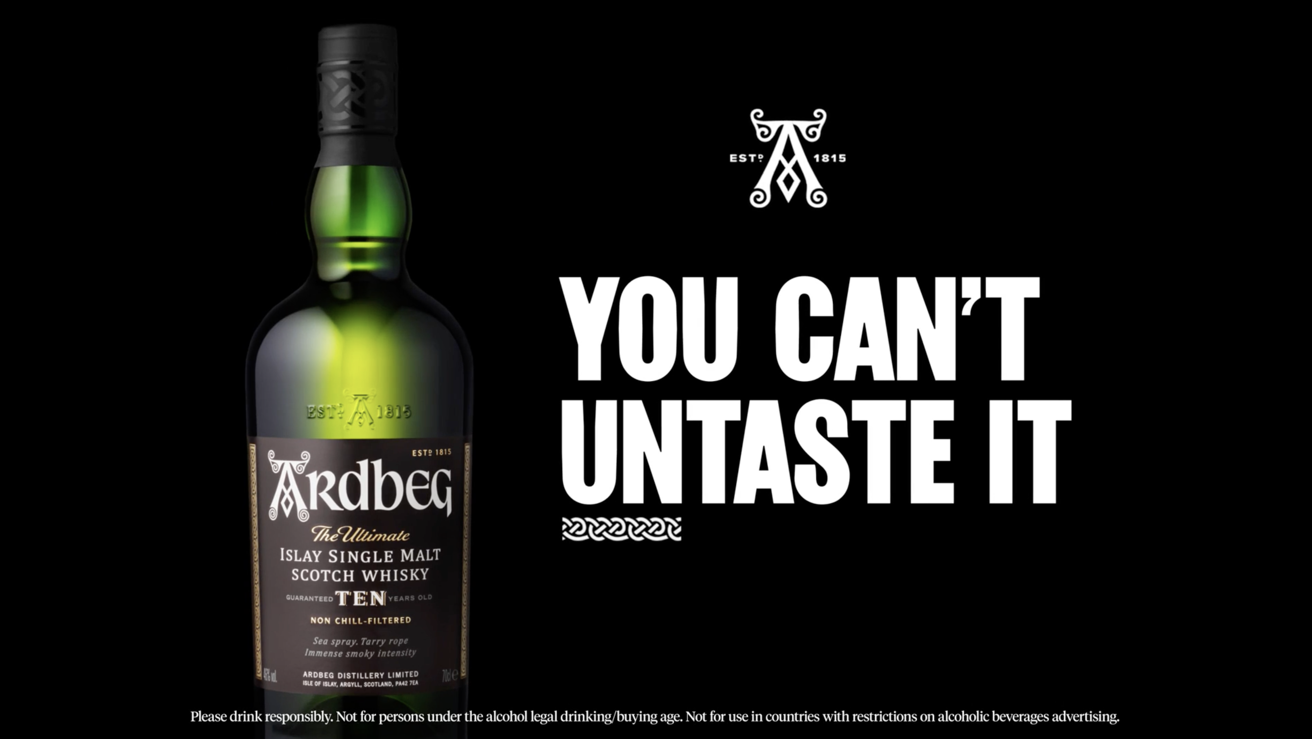
Text Media
I'm a Text Media block. I'm quite flexible you know and ave the following fields / features:
- Align Text — Use this to align the text to the right or left of an image (I should probably be renamed Text Image)
- Title — If you give me a title, I automatically become an H2. But you don't have to use me.
- WYSIWYG editor — Use me to add text, images, bullets etc and to set text styles
- Button Link — If you choose to add me, a button is added to me.
- Image — This allows you to place an image from the media library (and I'll be oriented to the opposite side of the text).
“I show friends the creative madness that comes out of Bright Signals and they're actually incredulous that this is classed as a 'job'. When your company submits an awards paper titled "Smashing The Haggis Glass Ceiling" you know you're on the right team.”
Source, Job position, Company
This following is an embed video component ↓
All I need is for you to copy and paste embed codes from Vimeo, our YouTube and I'll embed your video right here. We (Bright Signals) put the videos we want to feature on our site onto our Vimeo Channel.
I'm a Triple Column component
I am the intro text areas of the component. I can have various background colours from the range of colours in the our brands colour palette and at this width, I really need to have my class set as preamble, otherwise I would be hard to read.
Available fields and features
- Intro text — WYSIWYG editor
- Column 1 — WYSIWYG editor
- Column 2 — WYSIWYG editor
- Column 3 — WYSIWYG editor
- Button Link (if you need me)
- BG colour (pick 1 of 8)
I am column 1
Lorem ipsum dolor sit amet, consectetur adipiscing elit, sed do eiusmod tempor incididunt ut labore et dolore magna aliqua. Ut enim ad minim veniam, quis nostrud exercitation ullamco laboris nisi ut aliquip ex ea commodo consequat.
I am column 2
Lorem ipsum dolor sit amet, consectetur adipiscing elit, sed do eiusmod tempor incididunt ut labore et dolore magna aliqua. Ut enim ad minim veniam, quis nostrud exercitation ullamco laboris nisi ut aliquip ex ea commodo consequat.
I am column 3
Lorem ipsum dolor sit amet, consectetur adipiscing elit, sed do eiusmod tempor incididunt ut labore et dolore magna aliqua. Ut enim ad minim veniam, quis nostrud exercitation ullamco laboris nisi ut aliquip ex ea commodo consequat.
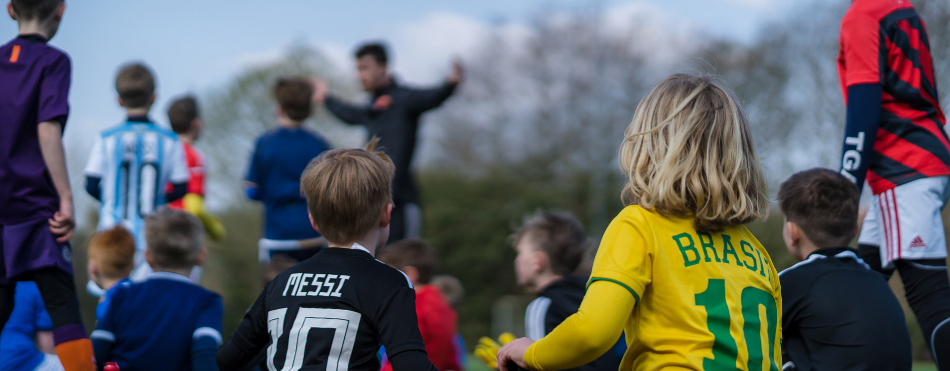
Behold! The Slider Gallery
I’m a great choice when you want to show off lots of photos of your work, events and activities!
With scrolling and arrow controls, you can post multiple photos and let users explore at their own pace.

Boo!
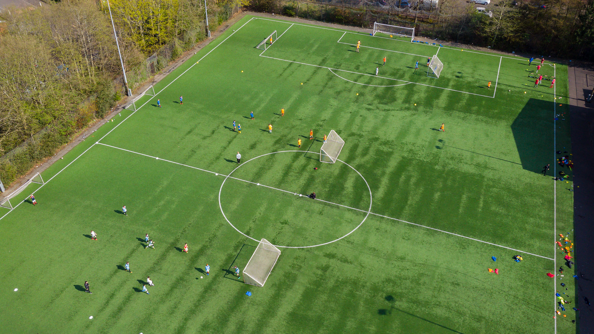
I am the Homepage Banner.
I’m the first thing people see, helping introduce what the page is all about. I give visitors a quick sense of where they are and what to do next, via clickable buttons and video links!
Want to highlight something in your project
I’m the offset text component! You can select a photo as a background with descriptive, offset text — and if you want to add a button or link, I can do that too!
Available fields and features
- Align Text — you can use me to position my text block to the right or left
- Text — A WYSIWYG editor (that's what I typed this text into)
- Button link — if you need to, you can add a button style link here.
Colour palette ↓
The BG colours available when colour is available to the blocks above are as follows...
Yellow
Black
White
Green
Blue
Orange
Pink
Cream
Have users share the word or get in touch with the Share Page component below! ↓